WEMC Tech Blog #2: Plotting NetCDF with Python
This example will examine how to plot time series wind measurements stored as NetCDF datasets, using Python3 (for info on installing Python3 and packages, see our previous blog).
If you would like to use the same NetCDF files, they can be retrieved from ECMWF using their web API. Once you have created an account with ECMWF, you can find the Python retrieval scripts for U and V wind components on my Github here.
Python has a wealth of package options for processing different types of data. For plotting NetCDF files in this example, the following packages are required:
Once the necessary packages and dependancies are installed, import them:
[pastacode lang=”python” manual=”%23%20importing%20of%20NetCDF%20files%0Aimport%20netCDF4%0A%0A%23%20plotting%20and%20data%20visualisations%0Afrom%20matplotlib%20import%20pyplot%20as%20plt%0A%0A%23%20n-dimensional%20arrays%0Aimport%20numpy%20as%20np%0A%0A%23%20high%20level%20functions%20for%20working%20with%20NetCDF%20files%0Aimport%20xarray%20as%20xr%0A%0A%23%20add%20colour%20labels%20to%20plot%0Aimport%20matplotlib.patches%20as%20mpatches” message=”” highlight=”” provider=”manual”/]
The xarray package provides some very convenient tools for working with NetCDF files. This example uses the xarray open_dataset function, to open two .nc files (for u and v wind components):
[pastacode lang=”python” manual=”%23%20load%20NetCDF%20file%20into%20variable%20-%20using%20xarray%20open%20dataset%20function%0A%23%20if%20using%20jupyter%2C%20make%20sure%20NetCDF%20files%20are%20in%20same%20directory%0Ads1%20%3D%20xr.open_dataset(‘ERA5_analysis_10U_165_2008.nc’)%0Ads2%20%3D%20xr.open_dataset(‘ERA5_analysis_10V_166_2008.nc’)” message=”” highlight=”” provider=”manual”/]
Typing the variable name and executing gives you some quick info on the dataset:
[pastacode lang=”python” manual=”ds2″ message=”” highlight=”” provider=”manual”/]
You can see the dataset ‘ds2’ contains hourly time-series, grid referenced data. With the variable v10 (describing the v component taken at 10 metre height). ERA5 data is taken at 0.25 degree resolution:
[pastacode lang=”python” manual=”%3Cxarray.Dataset%3E%0ADimensions%3A%20%20%20%20(latitude%3A%20185%2C%20longitude%3A%20271%2C%20time%3A%208784)%0ACoordinates%3A%0A%20%20*%20longitude%20%20(longitude)%20float32%20-22.0%20-21.75%20-21.5%20-21.25%20-21.0%20-20.75%20…%0A%20%20*%20latitude%20%20%20(latitude)%20float32%2072.5%2072.25%2072.0%2071.75%2071.5%2071.25%2071.0%20…%0A%20%20*%20time%20%20%20%20%20%20%20(time)%20datetime64%5Bns%5D%202008-01-01%202008-01-01T01%3A00%3A00%20…%0AData%20variables%3A%0A%20%20%20%20v10%20%20%20%20%20%20%20%20(time%2C%20latitude%2C%20longitude)%20float32%20-0.5332937%20-0.42049408%20…%0AAttributes%3A%0A%20%20%20%20Conventions%3A%20%20CF-1.6%0A%20%20%20%20history%3A%20%20%20%20%20%202018-06-22%2008%3A30%3A01%20GMT%20by%20grib_to_netcdf-2.8.0%3A%20grib_to_ne…” message=”” highlight=”” provider=”manual”/]
From these two datasets you can calculate the total wind speed. It’s important to perform this calculation before doing any time or location extractions, to ensure integrity of the data:
[pastacode lang=”python” manual=”%23%20calculate%20windspeed%0Ads12%20%3D%20ds1%0Ads12%5B’uv10’%5D%20%3D%20(ds1%5B’u10’%5D**2%20%2B%20ds2%5B’v10’%5D**2)**(1%2F2)” message=”” highlight=”” provider=”manual”/]
As there is one month of hourly data, the time series would be too long to efficiently plot across your x-axis. Luckily, xarray supports ‘group by’ operations. So you can quickly take an day’s hourly average, using the xarray groupby and mean function:
[pastacode lang=”python” manual=”%23%20get%20daily%20average%0Adaily_data12%20%3D%20ds12.groupby(‘time.hour’).mean(‘time’)” message=”” highlight=”” provider=”manual”/]
Next, select your desired grid reference, again using xarray’s sel function, calling the ‘nearest‘ method:
[pastacode lang=”python” manual=”%23%20select%20a%20grid%20location%20(lon%2Flat)%0Adsloc12%20%3D%20daily_data12.sel(longitude%3D14%2Clatitude%3D40%2Cmethod%3D’nearest’)” message=”” highlight=”” provider=”manual”/]
Finally, you can plot the data using matplotlib:
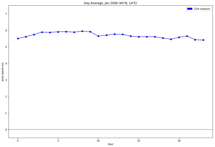
[pastacode lang=”python” manual=”%23%20plot%20time%20series%0Adsloc12%5B’uv10’%5D.plot.line(‘o-‘%2Ccolor%3D’blue’%2Cfigsize%3D(15%2C10))%0A%0A%23%20change%20y%20axis%20to%20show%20zero%20reference%0Aplt.ylim((-0.5%2C7.5))%0A%0A%23%20plot%20zero%20reference%20line%0Aplt.axhline(0%2C%20color%3D’grey’)%0A%0A%23%20add%20colour%20reference%0Ablue_patch%20%3D%20mpatches.Patch(color%3D’blue’%2C%20label%3D’10m%20analysis’)%0Aplt.legend(handles%3D%5Bblue_patch%2C%5D)%0A%0A%23%20add%20titles%0Aplt.ylabel(‘wind%20speed%20m%2Fs’)%0Aplt.title(‘Day%20Average%2C%202008%20(40%C2%B0N%2C%2014%C2%B0E)’)” message=”” highlight=”” provider=”manual”/]
Depending on your grid locations, you should get a plot that looks something like this:

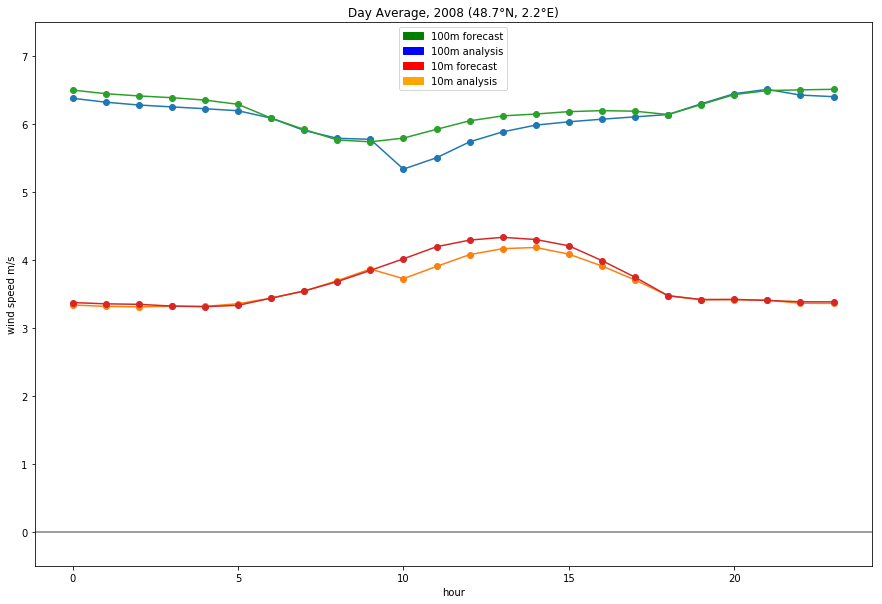
Repeating the above steps you can easily build multiple plots to compare different data sets:

For more examples on this, see matplotlib documentation.
The code for this example is on my GitHub
by Luke Sanger (WEMC, 2018)


