3 Questions with Elena Bertocco, Head of Communications, Branding, and Design at WEMC
Recently, we shared a blog detailing the development journey of WEMCs Teal tool, from its launch in 2020 to the present, exploring the technical development of Teal, from its origins to its design as a modifiable and extensible platform. We also highlighted how WEMC collaborates with partners to create bespoke versions of Teal.
In this blog, we shift our focus to another important aspect: design. Specifically, we explore how design enhances Teal’s accessibility and appeal. Elena played a pivotal role in shaping Teal’s visual experience, and we asked her about her contributions.
What was your role in shaping the visual design of Teal?
Elena: “My primary goal was to ensure that Teal was not only functional but also visually engaging and accessible to non-technical users. Climate data can be complex and overwhelming, and I wanted the design to break down those barriers. The goal was to make the tool simple, modern, and appealing, encouraging people from all backgrounds to engage with climate data. I believe design plays a crucial role in making information understandable and impactful.”
Your background in fashion design and art history is fascinating. How did those experiences influence your approach to designing Teal?
Elena: “My experience in fashion design and art history gives me a keen eye for aesthetics and functionality. In both fields, design isn’t just about making something look good—it’s about creating solutions and communicating ideas clearly. This approach was central to how I designed Teal. I wanted the interface to be clean and user-friendly, and the visuals to aid understanding. My previous work taught me how to distill complex information into clear visuals, which I applied when designing Teal.

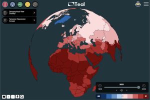
WEMC’s data visualisation Teal tool
For example, the colour teal was used for the tool’s background. Interestingly, this came from a back-end design error where the teal colour accidentally covered the oceans on the globe. But I liked it—it was fresh, modern, and helped users focus on the climate data.”
It’s interesting how a design accident became a defining feature of Teal. Could you tell us more about the design elements, like the icons and logo, and how they contribute to the tool’s accessibility?
Elena: “The icons were designed with simplicity and clarity in mind. Each one represents a different climate variable, like air temperature or wind speed. I used bold colours and clear symbols so users could easily identify what they wanted to explore. The interface guides users naturally, without overwhelming them with technical details.
The logo is another key element. It depicts the corners of the graph’s users can generate in Teal, symbolising the core functionality of the tool—visualising climate data. I wanted every aspect of the design, from icons to the logo, to reflect Teal’s purpose: making climate data approachable and informative.”

What’s next for Teal?
Teal’s journey is far from over. We’re currently tailoring the tool for specific projects, like the EU Horizon 2020 FOCUS-AFRICA initiative, and expanding its capabilities to meet the evolving needs of our users. We’re also exploring ways to integrate more advanced features while keeping the design accessible and user-friendly. The future of Teal is promising, and we’re excited to continue this journey.
Indeed, Teal’s development was a highly collaborative process, with the design and technical teams working closely to ensure a perfect balance between form and function. Integrating technical feedback into the design resulted in a tool that is not only visually striking but also intuitive and easy to navigate. The synergy between designers, data engineers, and software developers was key in making Teal a success, providing a seamless user experience while maintaining high technical performance. This collaboration has made Teal both accessible and impactful for a wide range of users.
To stay updated on WEMC’s events and news, please subscribe to the WEMC newsletter and follow us on Twitter, LinkedIn, and YouTube.


